Meeting the Mobile New(s) Consumer

I was totally misguided at first. I was too solution-driven rather than problem-focused.
This was 2016.
I was studying journalism at Rutgers. Everything was pointing toward the fact that journalism was losing touch with its users. I immediately began to pursue fact checking, thinking it was the cure to re-establishing the news' credibility. Boy, was I wrong.
I lacked a UX approach to what was really a UX problem. Yet, I'm thankful for this problem because without it I never would have found UX, a field where I feel at home.
So, I put myself to work, attempting to understand what troubled users about their news gathering experience.
UX Discovery:
Problems with the news
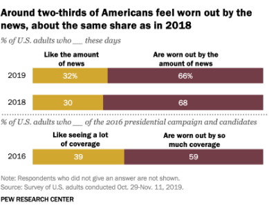
Information overload.
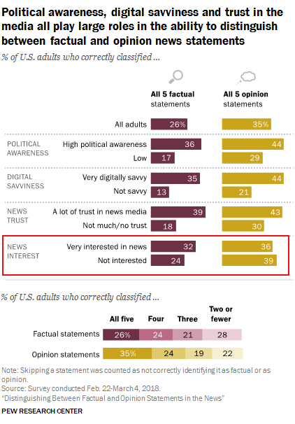
It’s difficult for users to decipher fact from opinion and so avoid bias
Even if they're already are very interested in the news.
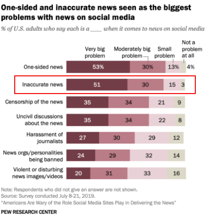
51% of Americans say that they expect news they see on social media to be largely inaccurate.
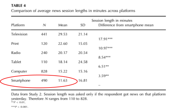
News 'snacking.'
In a study, it was found that users spend just 12 minutes or less per session checking their phones on their mobile devices.
Meeting the new(s) reader
I had some statistical evidence that pointed to a few glaring problems. But, I needed to understand the mindset of my users.
What was there specific news-gathering process like?
How was their emotional relationship with the news?
I had a total of seven interviews, all recorded over Skype with their permission. They came from all walks of life, from ages 23-68.
Here are some of my favorite quotes:
Synthesizing IDI Findings
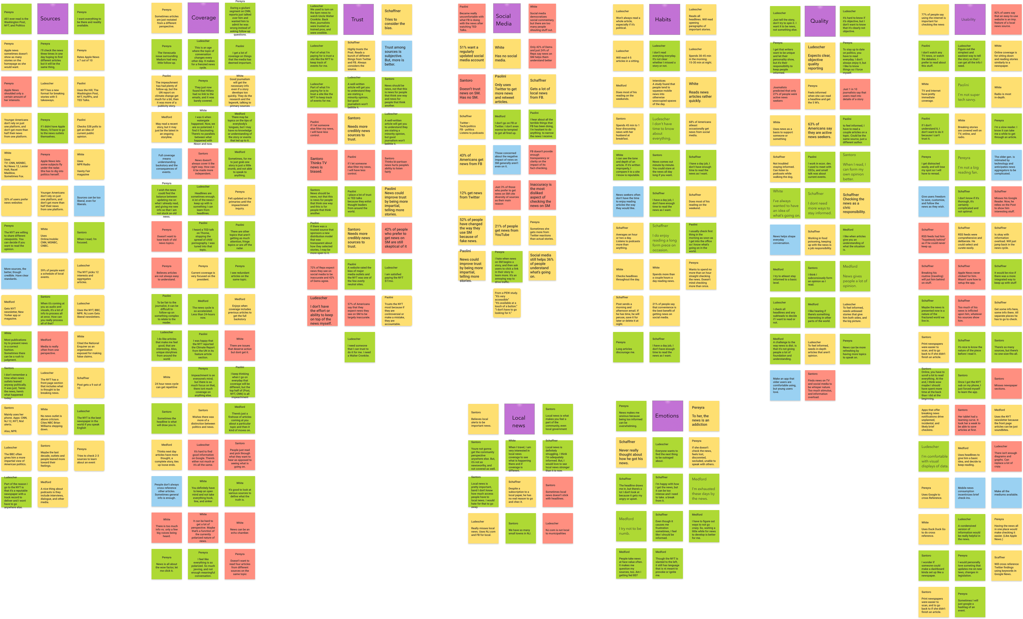
Affinity Map
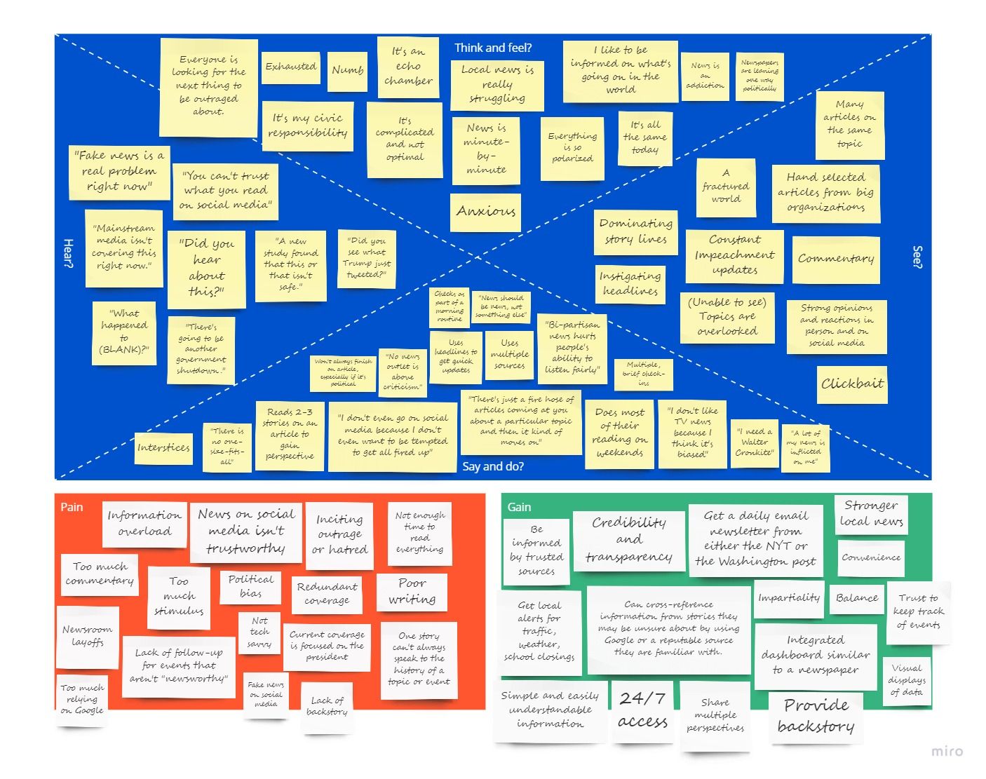
Empathy Map
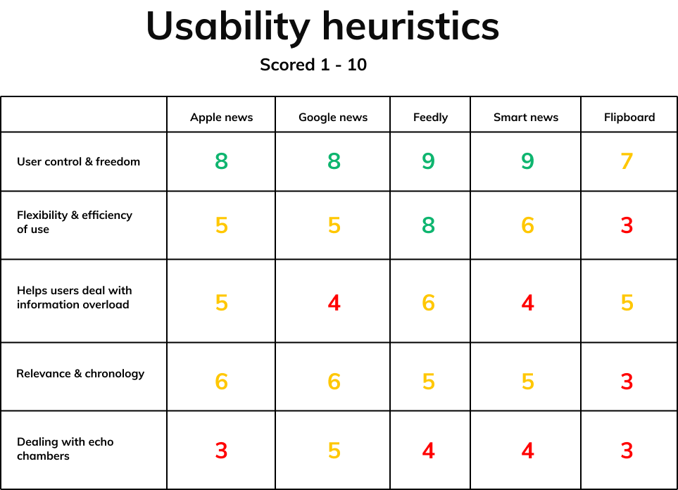
Usability Heuristics of Existing Solutions
Ideation
Now that I felt as though I had taken a walk in users' shoes, I began to implement divergent thinking. A solution was still too far off. I just knew I wanted to create something simple and effective, something that could distill the complexities of the news without leaving users with a hole in their understanding.
Job Stories

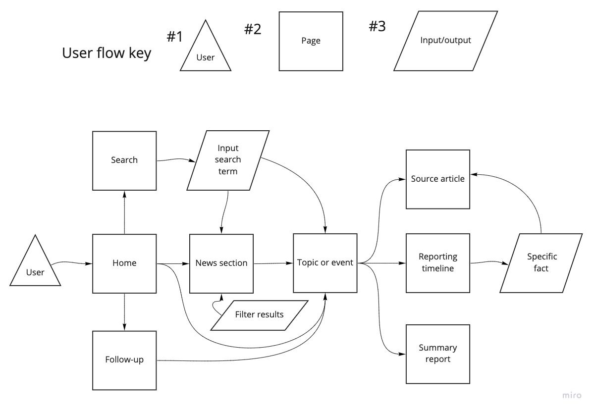
A Red Route User Flow
The flow featured below is intended to capture any context in which a user wants to investigate breaking news for the first time. This route not only shows actions taken by a user, but also conveys the information architecture of my proposed design.
Shaping a solution
How might we help users identify what is fact and what is commentary?
Just report the facts
The Globe takes curation a step further and begin to vet existing reports for users. Only factual statements corroborated by verified sources will be reported. Users will get to see how many sources agreed upon a fact, citations provided.
How might we help users navigate the news without exhausting them?
Provide aggregated & condensed reports
If a user is strapped for time, they can enjoy a quick summary report to inform themselves on the general nature of a news topic or event.
How might we prioritize credibility while providing a convenient news gathering experience?
Offer 'self-curation'
Users can fully customize their newsfeeds by creating news sections based on topics, events, or other related keywords they want to keep up with.
There is no algorithm that rewards viral news. All news is reported chronological.
How might we help users feel completely informed on a news topic or event in 12-minutes or less?
Provide complete reporting timelines
Users can also follow a news topic or event from its conception to its conclusion using a reporting timeline. Each reported fact on the timeline is timestamped with sources provided for the user's reading pleasure.
UI Design
Sketching
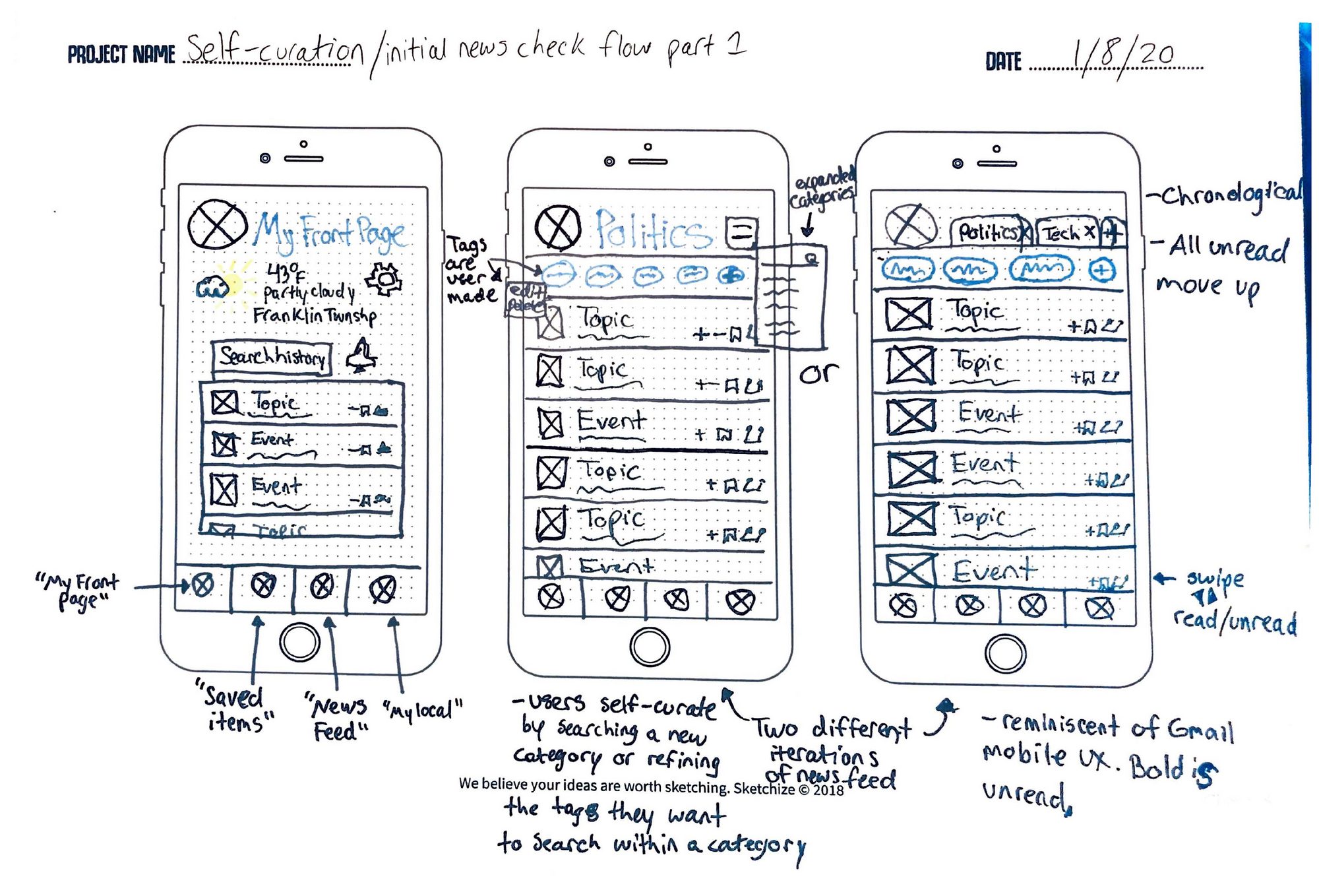
Version 1
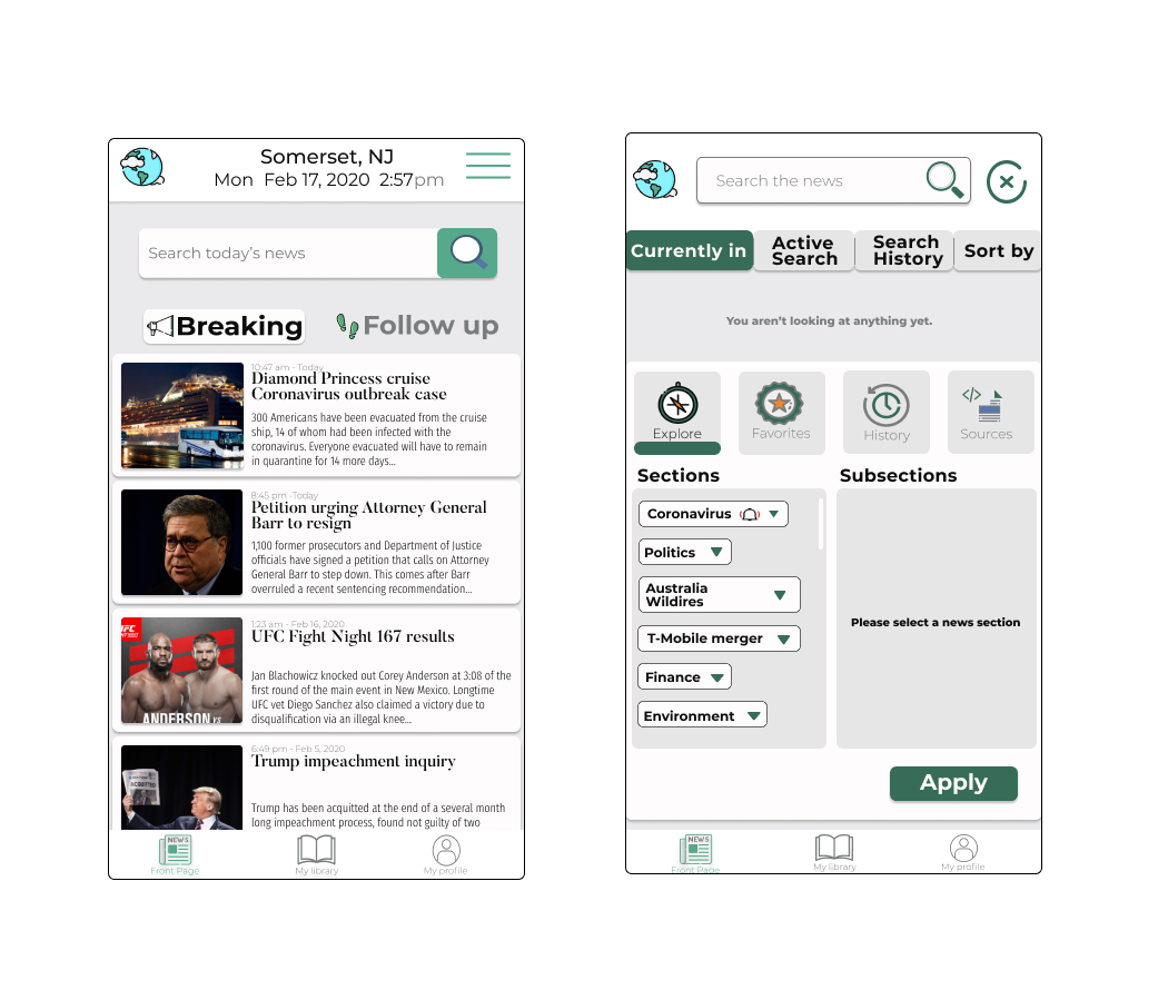
Challenges in my Early Designs
At first, I struggled to adapt the design specs to UI. Simplicity was the goal. But, it didn't feel intuitive. My initial usability tests revealed glaring issues in the navigation.
"Try not to hide things," a mentor told me. The main nav was tucked away in a hamburger menu in the upper right corner of the home screen.
I began to doubt myself. While my research and ideation were solid, the design wasn't taking the right shape. It didn't look or feel like an effective news aggregator.
The early designs also lacked whitespace. I heard that things looked 'busy' a lot.
Still, I persevered. I overcame adversity, and with each challenge I met I became a better designer. I am always learning that less is more.
From my Designer's Journal
"I am so relieved. I thought I almost lost the essence of my design. But, I was able to keep it simple while allowing a great, functional control of the news. My mentor said I made great improvements. The wireframes are complete. I'm very excited to move forward with the content hierarchy. I think it will breathe life into the app and make the UX more much engaging, though it's a serious solution..."
Version 2
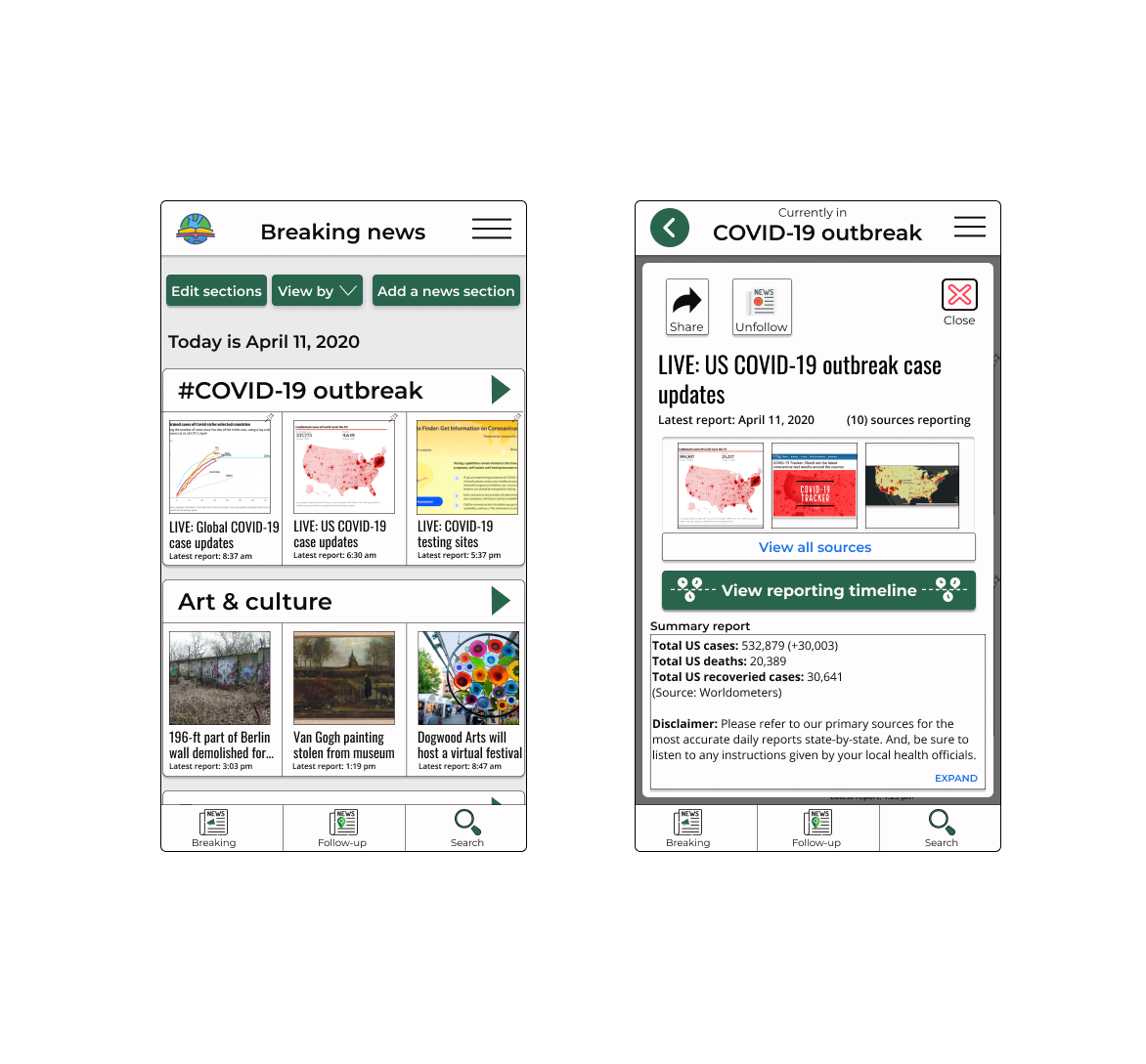
Next Steps
User Research
I'd like to conduct a hybrid research approach that is part user interview and part usability test.
I'm also quite curious how users assess the news. Is there a mechanism by which users measure credibility, and can it be quantified?
Remaining Assumptions
#1
Politics and legislation may require its own unique UX.
#2
It would be helpful to highlight citations found in articles, and timestamps found in videos.
#3
Users would appreciate being able to view profiles of news sources and journalists, whose performances would be scored by some sort of metric.
#4
Users would appreciate a 'view backstory' feature on topics and events.